You've started building your website yourself but have no design experience what so ever and how to make it visually appealing? That's what this article is about. I'm going to show you a few basic design tips that are fundamental when building a website, article, designing a flyer, poster or anything in that matter.
The first step to having a great website is to have great content but it's equally important to be able to present this content in the right way. What's the point of having compelling texts and ideas on your website if they are not shown in a way to catch the visitors attention and they bounce right away?
Tip 1: Select good fonts, colors and spacing
Presenting the texts on your website is the single most important part. After all the visitors come to read or review content there so you need to make it easy to read. You should stick to the most commonly used fonts for the paragraph texts such as Arial, OpenSans, PtSans, Helvetica, Roboto and a few more (this article is written in Source Sans Pro, also a pretty popular font last years). They are easy on the eye, people are used with these fonts over the years. Of course, you can use a bit more interesting and fun fonts for not that long paragraphs and titles to make the website a bit more fun and not so boring.
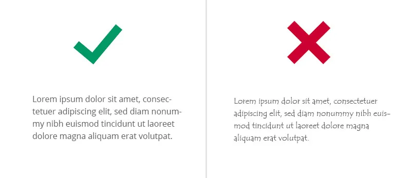
It's almost never good to use too light or too dark of a color for texts. Dark gray for the texts to contrast nice on the white or very light background and a bit darker or a website theme color for the titles to focus more on them.
Letter spacing is a key. You need to leave enough room between the lines to make it more appealing to read. If you're writing a blog it's always nice to leave a bit bigger space between the lines. Always leave more room beneath the titles to have a more distinct separation between it and the paragraph text.
Tip 2: Use high-quality images
As mentioning in How To Build The Perfect Website For Your Small Business great images are a key to a great website. It's the visual presentation of what your brand and website stand for. You need to select high-quality images that don't deviate too much of one another. Let's say you're creating a gallery or a slider with images. Pick images that have something in common, either or theme, place or a project.
An other example is picking icons that show features on your website. Keep them the in the same design direction. Don't mix outlined with full-color icons or flat with non-flat. If you go in one direction, stick with it. This shows that you have a clear vision and theme in your website and it's not stitched from different places. This same philosophy is accurate for the fonts as well. Don't mix more than 2-3 fonts in your website. First, because importing too many fonts slows your website but mostly because it won't look coherent.
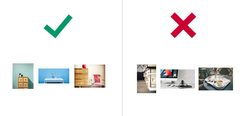
You can see how the images on the left have the same theme, the same minimalistic approach. When the images on the right are also nice but do not share the same vibe as the others so they don't go well together. So when selecting images for a page or a gallery/slider keep that in mind.
A common mistake is to upload images to your website that are straight taken from the camera or phone with very high resolution. Don’t get me wrong, your images should be nice and crispy but are usually too big and heavy for a website and will load way too long for the visitors.
Picresize (http://www.picresize.com/) is a nice place to upload and resize your images. A good image size is no bigger than 500kb and 1920x1080.
What if I don’t have nice images like I’ve seen on other websites? You can go to Pixabay (https://pixabay.com/) an awesome place for royalty free images that you can use freely on your website. The images there are usually web ready in pretty small sizes so no need for resizing and wasting time on that.
Tip 3: Content alignment and spacing
Structuring your content on the page is very important. You should always leave a "room to breath" for the elements so they don't invade the other elements space. Think of it this way - almost always there should be nice padding around an image for example. Take a wrapper in your hand to see how everything has some kind of alignment and spacing either in the fonts or between elements.
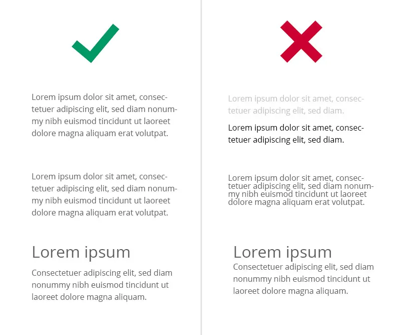
Below is an example of item alignment and spacing between elements. Notice how there's enough room from image to image and from image to title.
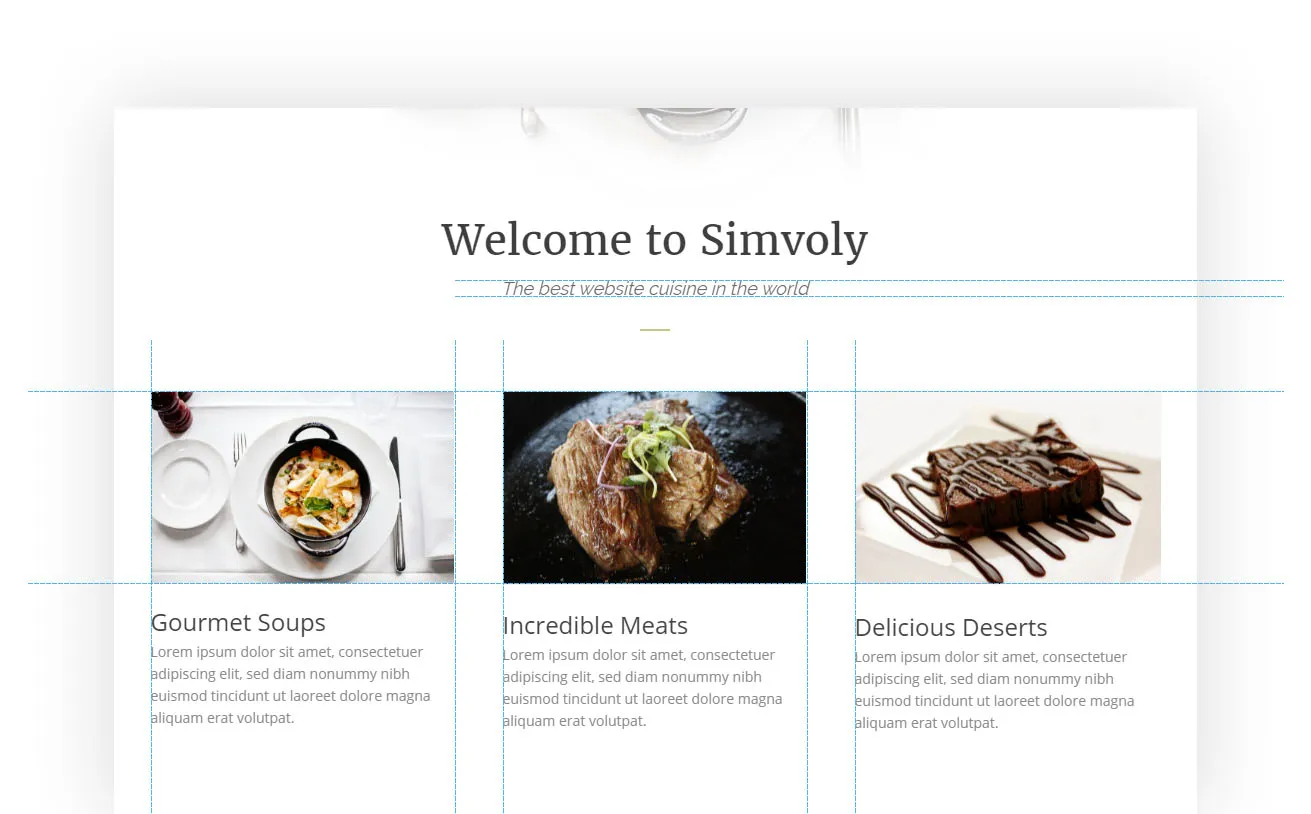
Click the image to enlarge
Alignment is the other key thing when structuring your content. Don't just put it there on the page, think how to structure it. In the image is shown how there are 3 columns with content, each with same width and exactly same structure, be consistent. You should always follow a column grid to structure your content. It shows professionalism and if it lacks it's so obvious and often drives people from the website.
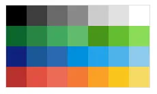
Tip 4: Color scheme
It all depends on the website but usually never good to go beyond two or three main colors for your website. I personally prefer one main color and one secondary. By main and secondary colors I'm referring to colors that are known as brand colors. Take this blog, for example, there's one main color (blue) and a few repeating colors along the whole website. Don't go too crazy with picking a lot of colors and mashing them together, keep it clean.
There are places to pick nice palettes if you're struggling with what goes well with what such as Coolors.co (https://coolors.co/). I've also handpicked nice arrangement of colors for our color picker at Simvoly. The colors are nice and warm and easy on the eyes and they go nice together most of the time. Don't mix warm with bright colors, most of the time is not well suiting.
These are some of the fundamentals for having a clean and professionally made design. We live in an era where less is more and that's a great thing. This brings my favorite minimalism into the design, flatness and cleanliness. Look at Apple for example, they are a classic example for how simplicity is elevated on such extent that is leading to such success. Keep it simple, keep it clean. And I'd like to end with my favorite quote from Antoine de Saint-Exupery "Perfection is achieved, not when there is nothing more to add, but when there is nothing left to take away."
Let me just remind you that Simvoly is an awesome builder where you can bring your ideas into reality. It's free, very simple and has beautiful themes to choose from and play around with.